https://spark.adobe.com/page/ZTVLNJtzUK2un/
Final Showreel
The fully completed and compiled together showreel with breakdowns.
I would honestly say that this looks better than I expected. But there are many areas I can improve
Projection mapping:
The projection mapping is the part I am most proud of, the whole shot looks incredibly high detail and the depth of field sells it at the end.
For improvements, I would add something to the scene to sell the 3D, such a plane flying through or a spaceship with a large glow. Something that can interact with the environment I’ve made to make it pop more.Secondly, i would have liked to experiment with more camera angles that potentially would have required more modelling and Photoshop work but would have allowed for more grand camera movements through the scene.
Camera Tracking:
The camera track itself I am happy with as I got a 0.2 solve error on the track. What I would like to have done is have more usable footage to choose from. From earlier blog posts I found myself with only one piece of footage that was had enough lighting and contrast to get a reliable track.
As well as this I feel like I can expand more into adding additional models to the scene, as well as potentially rebuilding the scene to allow physics objects to work with it.
Flight Stick Model:
I learned a lot while making this, and there is still a lot to learn. This only something I can improve upon by modelling more and getting the feel for the shapes I want to create. While the model and textures are not bad. I feel like seams on the model stand out too much and are slightly distorted. This could be because of my UV’s or just not high enough quality on my textures. I feel like I should look into the sculpt tools next time and learn how to use them to help achieve the shape I want.
Modelling Development 2
After my previous attempt at the model. I took into consideration starting again and designing the model in chunks. This allowed me to bevel edges at will and overall have a much more smooth design on the model.
This also meant that and slight errors I made did not affect other areas of the model allowing me to slowly build up.
Everything up to the grip and the flight stick went well, as once again the smooth design became difficult to match as well as the slight angle changes.
Instead of following through with using a cylinder for the stick I decided to build off a cube and utilize the fewer edges and faces to help me understand where I need to add extra edges to get the shape I needed. This ended up working better than I expected, as I had much more control over the shape in the smoothed for as well as being able to pull and drag out at odd angles my quickly making more cuts with the multi-cut tool.
I decided to separate the flat part of the grip and attempt to crash them together. I soon released this wouldn’t work as the differences in edges made the clash stand out. So I used subdivisions to match the number of edges and connected them together although it was a lot of work to mesh them together the final output eventually looked accurate with a slight bit of tweaking.
The button layout I could just put against the stick at that how it is designed on the actual model so was simple to design but provided a key point to help fix the angle of my stick and the way it looked to match the real thing more.
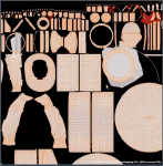
My original UV unwrap went wrong as I forgot to combine the meshes a simple mistake that was a good for learning.
My second UV unwrap was slightly stretched but I decided to look past it for the time being
While in substance painter I began to look into ways to paint the seams in the model. At first, I looked into how to paint onto the normal map but I couldn’t get it to work. But while playing about with settings I saw that I was able to adjust the height of a brush. So after a bit of testing with masks, I found it gave the exact effect I wanted and proceeded to repeat this across the model. Utilizing masks and different smart materials I got the exact look I wanted. and moved it back to Maya.
As I would be using the Arnold render in Maya I checked first to make sure I was exporting my textures right.
I used this video until I learned that Arnold had been updated to version 5 and no longer worked the same way, so instead, i followed the table on (https://support.allegorithmic.com/documentation/display/integrations/Arnold+5+for+Maya) this allowed me to know exactly which textures I needed to export.
This is where I realised i hadn’t applied the smoothed view to my model. this meant I had to repeat the whole process again, however, in this process I fixed my UV’s to be almost perfect with a little stretching.
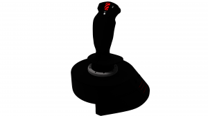
Finally, it was finished and here is the final result.
I was unable to export the model with textures. Something which I was unable to resolve
The one problem i’m having is with Arnold render’s lighting system. It is incredibly dark without a world light and in turn, destroys any shadows with a world light. This is forcing me to change my final plan idea and just show the model and the render. Instead of merging it into a still image.
Modelling Devleopment 1
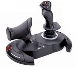
For my modelling I chose to do the right side of the Thrustmaster T-Flight Hotas X. I chose this as it would provide a challenge to model the complex shape of the stick itself as well as the small details required in the texture
Here is the video showing my modelling process
During the duration of the video, I realised very quickly how many ways there is to design this model. I attempted to design it all in one go Extruding from my original base onwards. While worked for the basic poly model, the smoothed version started having clipping problems as I began to bevel the edges to smooth them out.
I continued on and attempted to use the sculpting tools to create the indents into my model as seen on the base. After watching some tutorials briefly to try and get it to work, I found that my model was not high poly enough and when subdivided reacted poorly to the inverted lift tool. This left my mesh in an unusable state so I backtracked and attempted to continue with my original method.
After finishing the base, I wanted to see how it would texture, so I performed a quick UV unwrap and exported it as a .obj for Substance Painter. During my time in substance, i began to have trouble with the texturing process and the use of masks. I will need to watch some tutorials as a refresher to understand where I was going wrong
I continued on with the models and quickly learned how awkward the stick was to model. As the grip is designed to be held comfortably so is shaped like the inside of a hand that was extremely difficult to replicate with Maya.
When reaching the top of the stick the sudden transition from smooth the straight edge became extremely confusing for myself to get right in the smoothed view. So I decided to rethink my plan to model this
Reflection
To build this model I need to rethink my approach to building it. Building it all as one solid object means the smoothed view does not look natural and attempting bevels on surfaces that change begins to create clipping issues meaning an overall tougher job.
It has been a while since I used Substance Painter and I’m in need of a quick refresher to get myself up to speed, I should also look into how I can affect the normal’s to create the seamed areas of the flight stick without modelling them to save on clipping errors.
Sculpting in Maya is completely new to me. And something that I would like the research in the future and it potential uses. Otherwise for this project i don’t think it will be necessary to get the final product I want.
To Do
-Attempt to model the flight stick in individual sections and combine them together when finished.
– look into more tutorials on hard surface modelling to potentially pick up some tips
-Watch some tutorials on Substance painter to get back to grips with
-Research how to affect normal maps within substance painter.
Camera Tracking Development 2
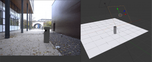
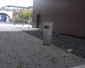
From my last development, I decided that I should model a bin to add to the scene.
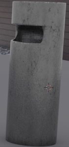
The model is a cylinder with a hole inside modelled in Maya and textured in substance painter.
Here is the creation of the bin
I tried around with different shapes until I found one that I liked.
Here is a simple render of the bin.
The bin is a simple grey steel with a slight amount of dirt gathered mainly at the bottom. I felt the bin was a good choice to fit in the scene as it is something that can exist in the scene without diverting the attention from whatever the shot could be about.
The bin sat in the track well when placed, but the lighting was the key problem I was having. What I attempted at first was the use of 2 area lights. A strong backlight to match the shadows in the scene and give light wrap and front light to stop the front of the bin from being dark.
This method completely washed out my shadows and made the bin stand out in the footage due to its lack of place in the scene.
My next attempt was angle the light so it wouldn’t hit the ground and destroy the shadows, This, however, did not work at all and just made the bin bland as seen in the video below
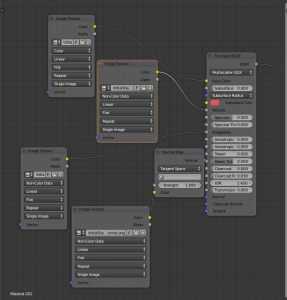
With some help from Jon, i found that a lot of my settings were wrong. I had imported my textures through the nodes as colour channels when they should have been non-colour data as well as this, I had not set up my metallic texture, meaning the bin was not taking in the colour reflection for the floor.
Here is the correct setup for the node
This allowed my model to look as good as it could for the scene.
The next thing was the introduction of world lighting, instead of relying on area lights and reflections off the ground.
Adding the area light brightened up the bin to a light level, but did have the adverse effect of damaging the shadows in the scene
This was fixed by adding a larger area light to mimic the sunlight. Next came lining up the shadows to match the scene and that led me to the final render

